Universal Application
"The secure online profile to apply to any job opportunity"
Most job application design assumes the applicant has a laptop, a quiet room, and enough time to fill out the same form they filled out last month. For the hourly workforce, none of that is true.
Hourly workers are the most mobile segment of the labor market. And every time they move, they start from scratch: the same fields, the same documents, the same information handed over to a new system that doesn't talk to the last one.
Universal Application was built to end that. One secure profile. Every opportunity. For the rest of your career.
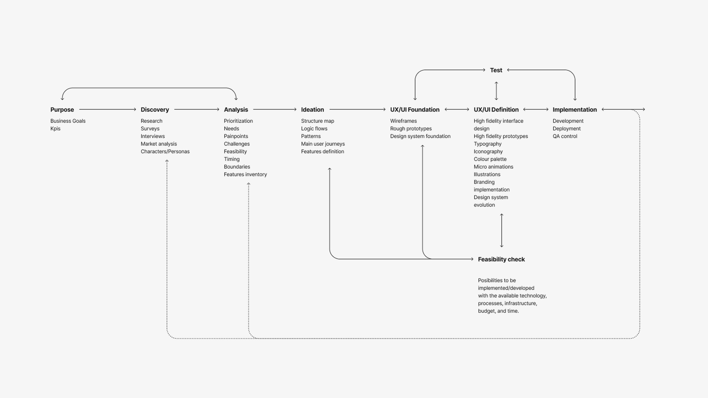
The product existed. The challenge was how to improve it.
"The brief was to redesign the interface. The research told us we had to build the system first."
The existing Universal Application worked faster than paper. But with rigid layouts. No responsiveness. Visual inconsistency across flows. Navigation that required too much from users completing tasks on a shared kiosk in a busy hiring location. The brief was to fix it. The research told us the fix had to go deeper.
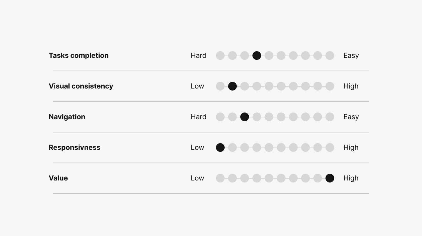
7 users and 3 customers gave us a clear picture of where the product stood. The concept was right: they valued having a digital application over the traditional offline process. But the execution let it down across the board. Responsiveness scored lowest. The interface wasn't built to work across contexts, screen sizes, and different environments. Navigation was workable, until users hit the flows that required multiple steps and data entry — there, it broke.
Task completion and value scored better, confirming the product concept was sound. The reframe was simple but significant: this wasn't only a UI problem. It was a foundation challenge. You can't fix screens built on a rigid, non-systemic approach. You have to replace the base.
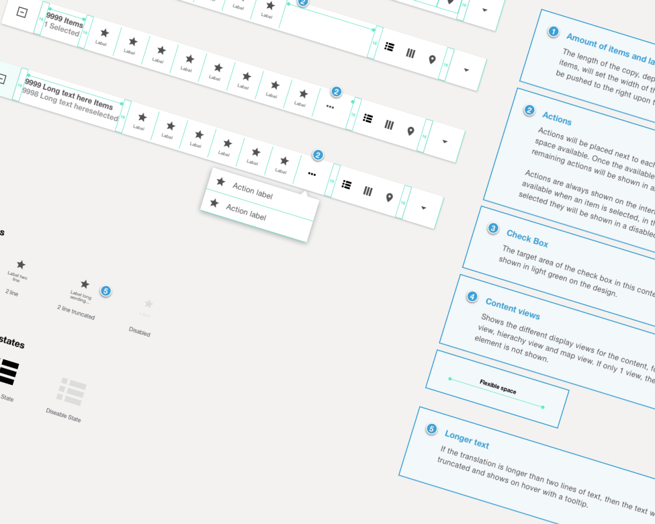
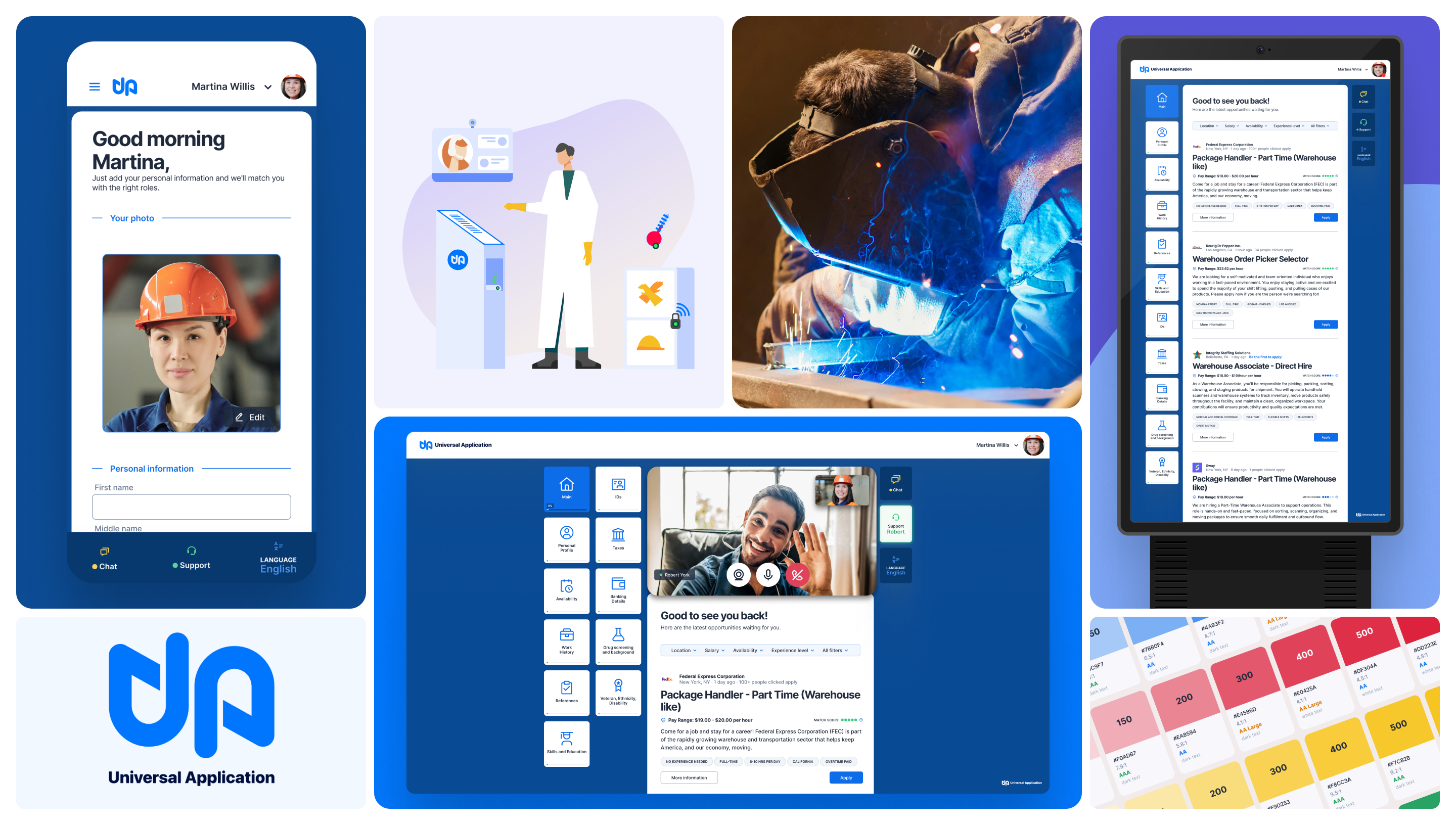
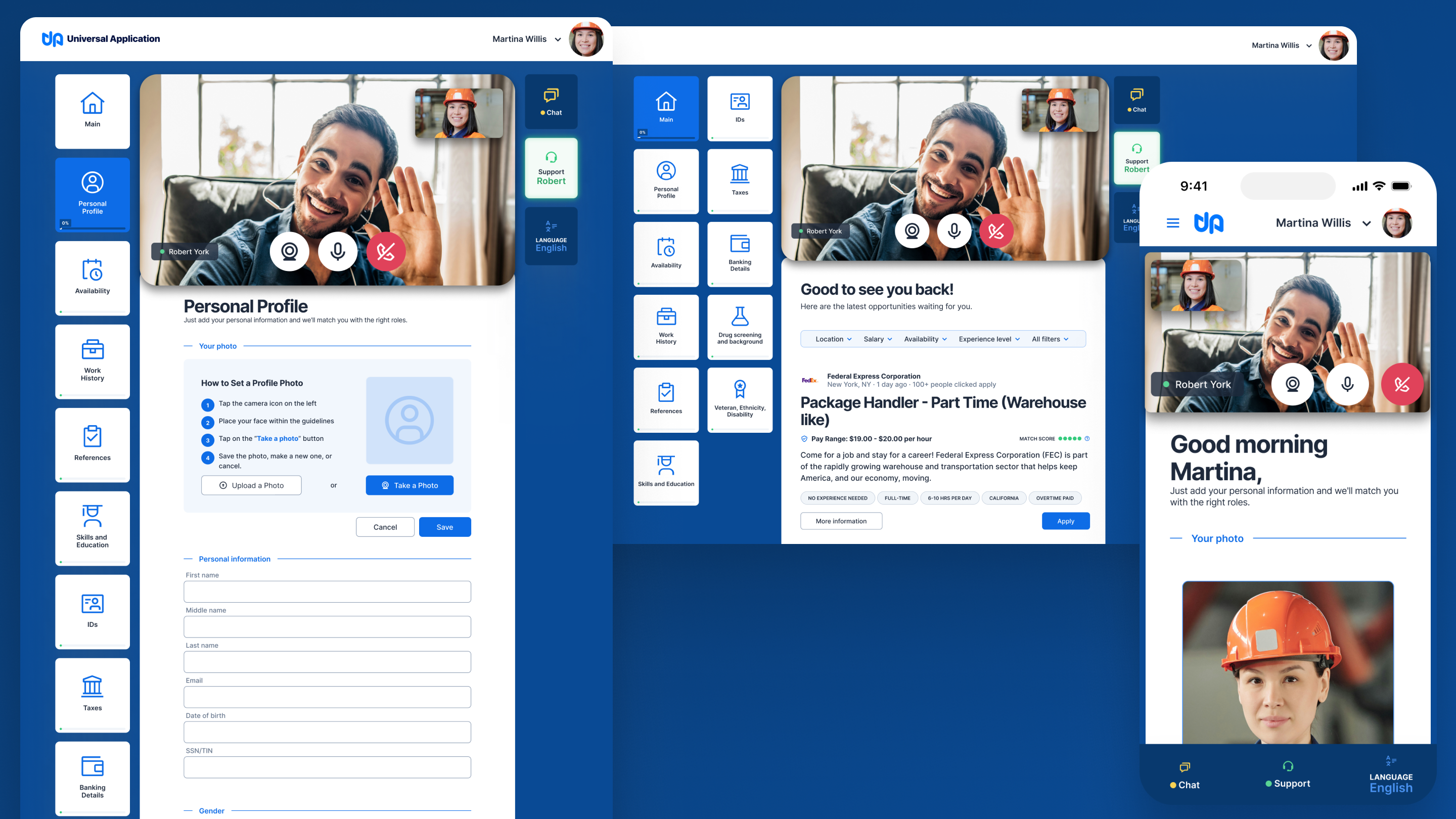
Kiosk, desktop and mobile breakpoints
Universal Application serves two sides of the same transaction, but the design priorities are asymmetric.
Both users interact with the same product, but they never see the same interface. The applicant is filling in. The employer is pulling out. Every design decision had to serve both without compromising either.
The Applicant · Hourly workers · Job seekers · Career changers
Fills out the same application form repeatedly across their career. Needs to apply quickly, from wherever they are, often from a kiosk at a hiring location or from their phone. Has no patience for complexity, and shouldn't need any. Needs: one profile that works everywhere, simple data entry, clear progress, portable career history.
The Employer · HR managers · Operations leads · Hiring coordinators
Wants candidate data fast, consistently formatted, and integrated directly into their existing systems. Managing high-volume hiring for hourly roles means speed and data quality matter more than anything else. Needs: ATS/HRIS integration, verified documents, objective candidate data, compliance support (remote I9).
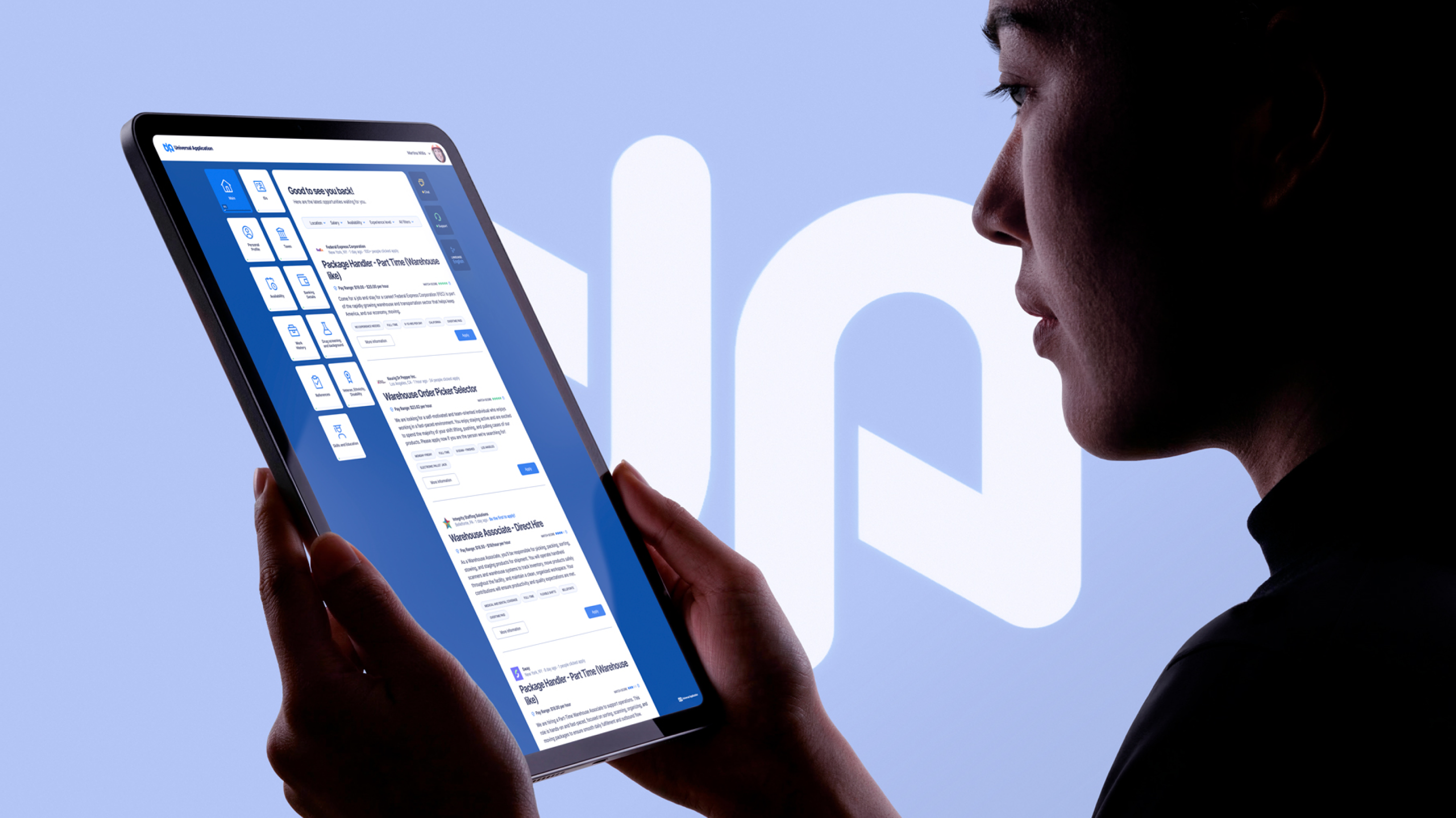
The instinct in most digital product work is to design for mobile first. For Universal Application, the right order was: kiosk first, then mobile, and desktop.
Kiosk-First Design
The kiosk context is the most constrained: fixed screen size, touch interaction, shared public device, no keyboard assumed, time pressure in a hiring environment. Solving for those constraints first meant every decision was stress-tested at the hardest edge. Mobile and desktop inherited better solutions rather than requiring new ones.
Brand-Agnostic System Architecture
Universal Application is a white-label product. Any employer can deploy it under their own brand. This isn't a configuration setting — it's an architectural requirement that has to be built into the design system from the start. The system uses a token layer as the abstraction between structure and brand identity. Layout, spacing, component behavior, and interaction patterns are defined once at the system level. Any third-party brand can slot in without touching the underlying components.
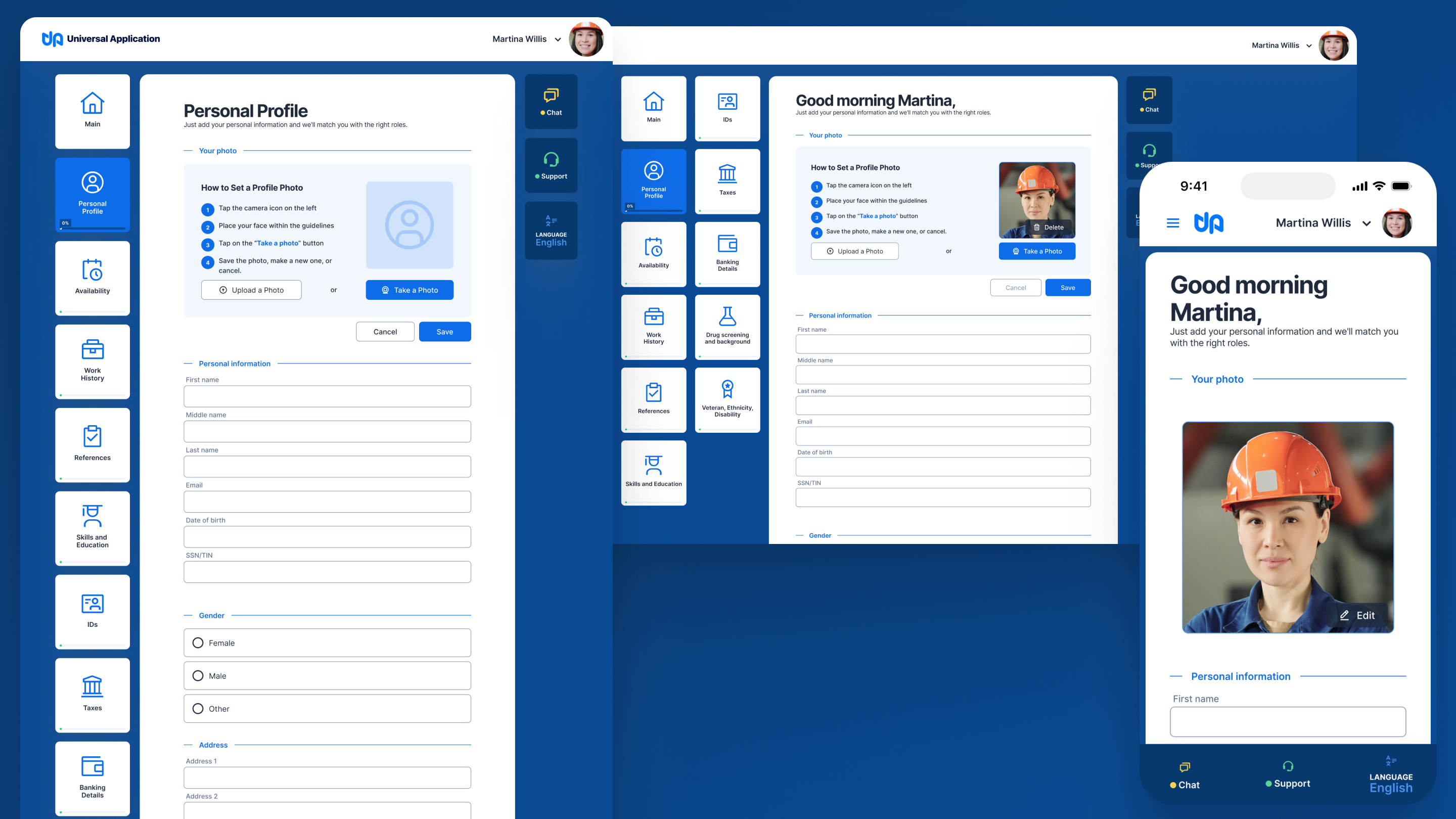
Forms as the Primary Interface
The entire product is, at its core, data entry. Candidates build profiles. Employers review them. Documents get uploaded. Certifications get verified. The design response was to treat forms with care: generous spacing between sections to lighten long flows, content-first layout that prioritizes what the user needs to provide over what the system needs to capture, and progressive information reveal to avoid overwhelming users at the start of a complex flow.
The system works for Agile Force's brand today and for any employer's brand tomorrow.
Sitemap
The sitemap was built from the current structure. Research identified where users were getting lost and where the information architecture assumed knowledge they didn't have. The result kept what was working and restructured what wasn't, with the multi-platform context factored into every navigation decision.
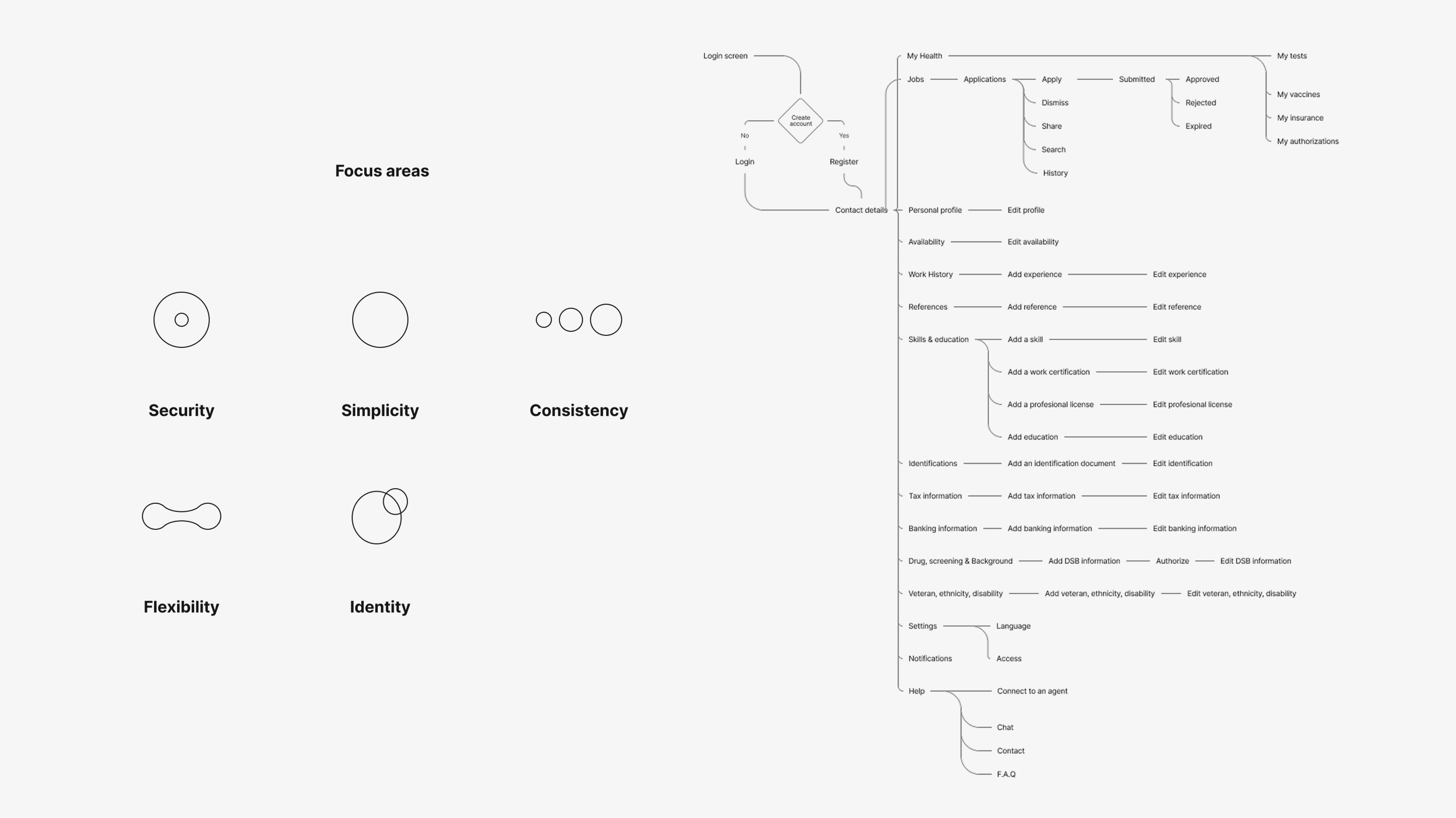
Sitemap
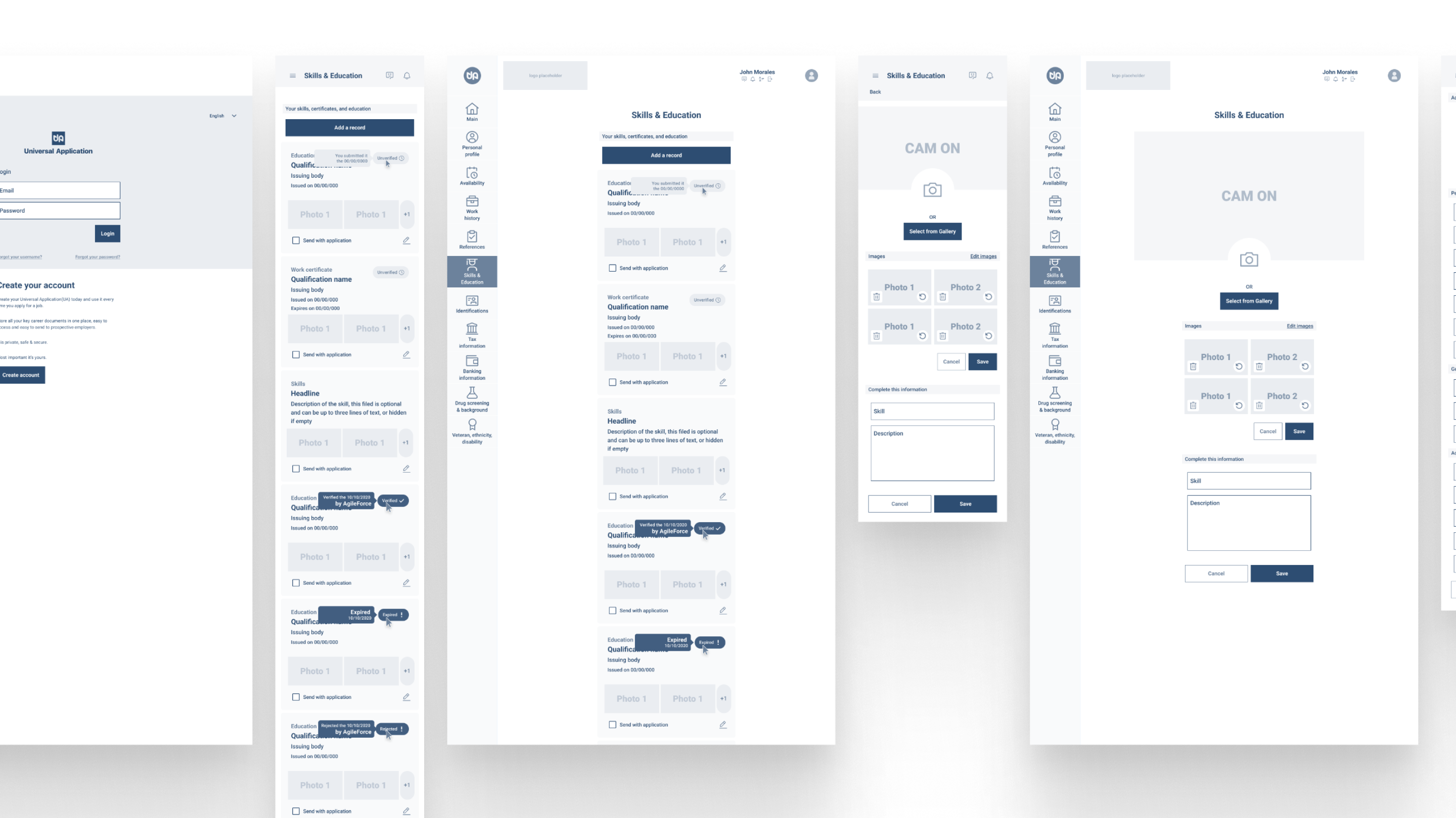
Wireframes
Accessibility
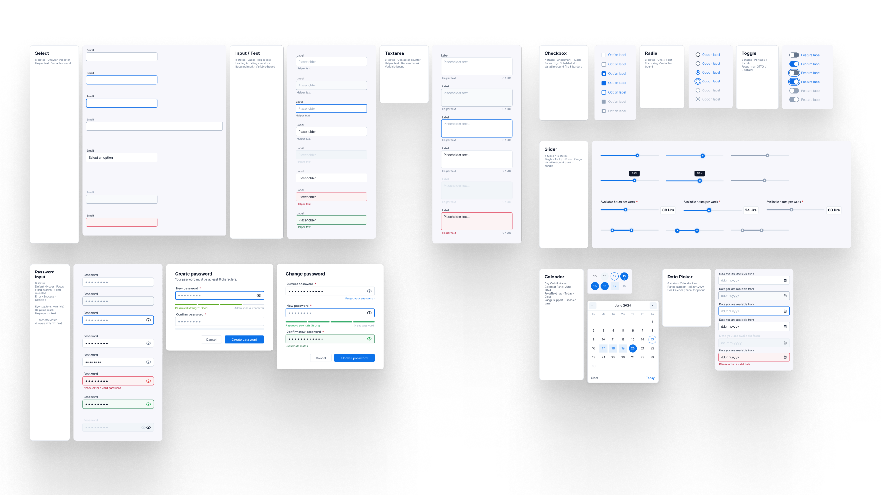
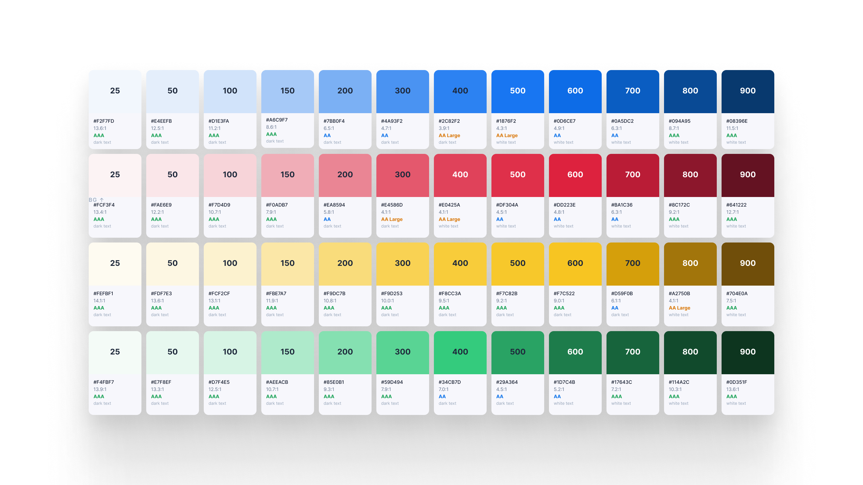
Modular Design System
The final interface runs across kiosk, mobile, and desktop — three platforms, one system.
Each screen is an adaptation of the same components and logic, not a separate design. The entry point for candidates on their own device. Minimal, fast, single action per screen. The kiosk-first logic shows here: the layout holds perfectly on a smaller personal screen because it was already designed for touch and simplicity.
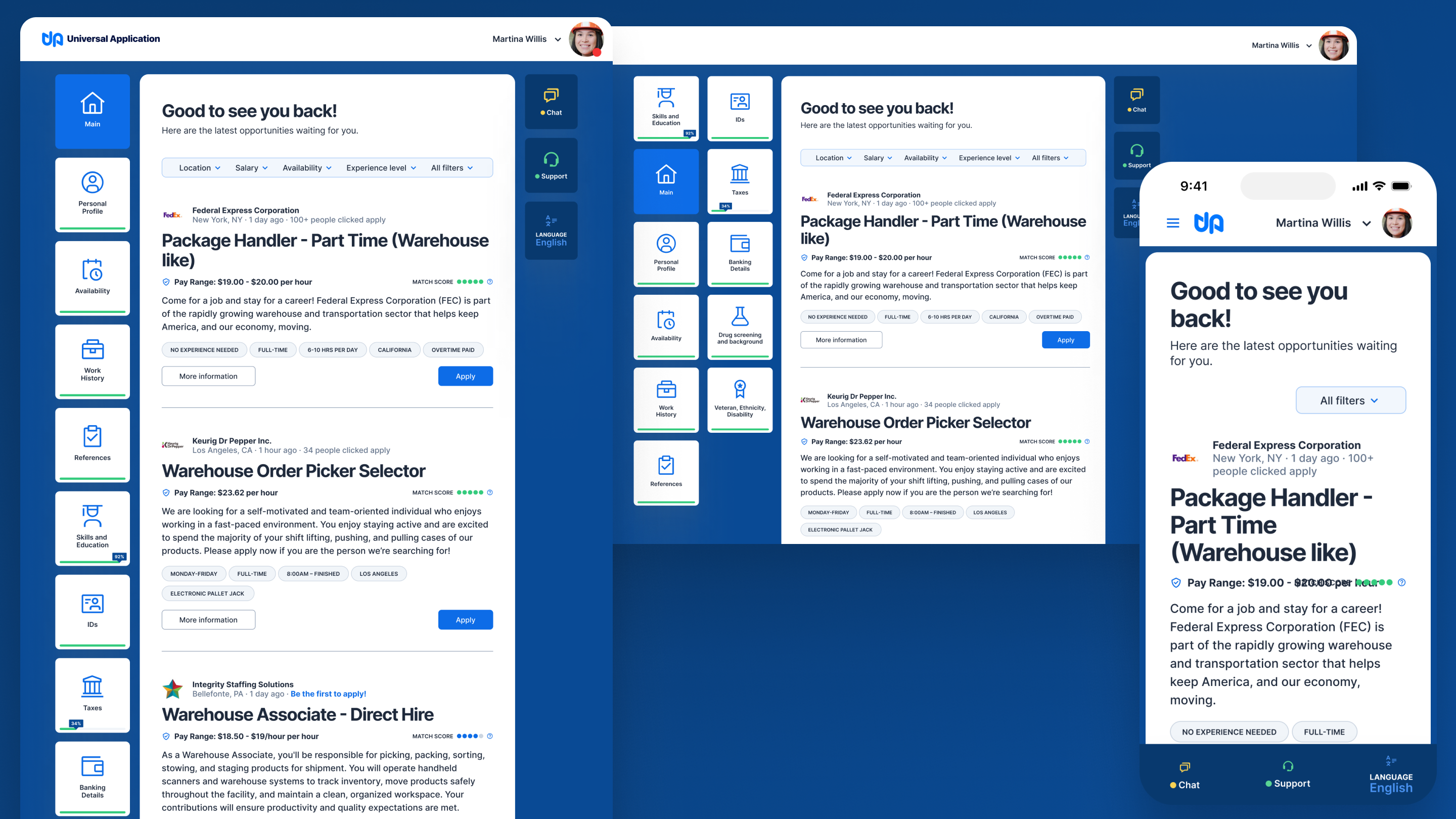
Use main section
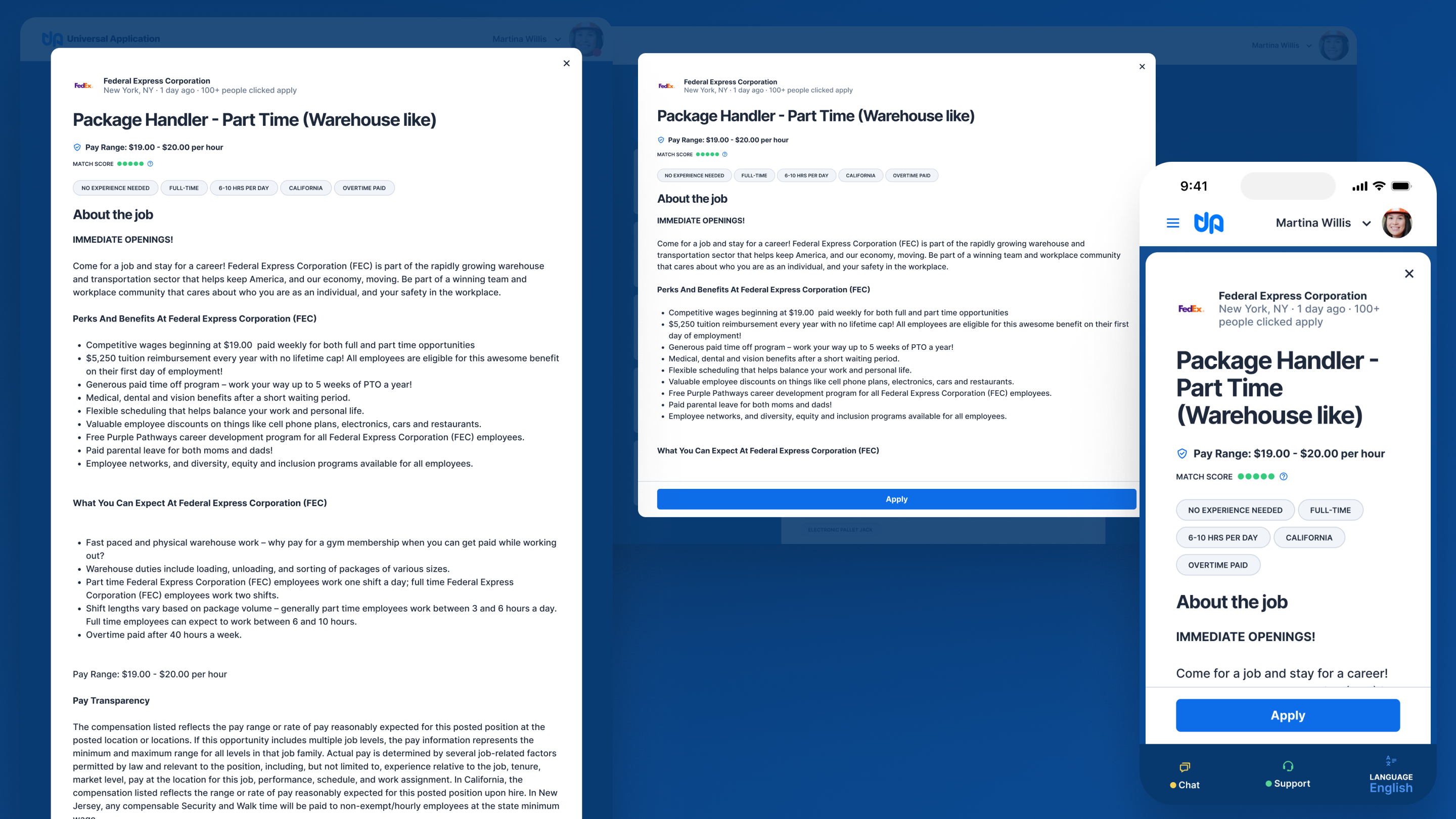
Job description detail
Online support
Personal profile
A better foundation changes everything.
This was a rebuild from the ground up. The redesign addressed every failure dimension identified in research: fewer steps to complete the most frequent flows, standardized UI language and patterns across the entire product, common tasks completed faster and more reliably across environments and devices, better integration and display of third-party data, and content structured around the nature of each flow rather than the system's internal logic.
The product continued to evolve after launch. Tweaks to the profile section and double authentication were introduced to address technical issues with a key customer. A system built on solid foundations absorbs those changes without breaking.
The most important decision in this project happened before any design work: agreeing with the development and the team that the existing user experience had to be updated.
That's a harder conversation than a redesign brief usually requires. It means telling a client that the investment in the current version doesn't carry forward. But the research was clear, and the alternative — layering improvements onto a non-systemic foundation — would have produced a more polished version of the same underlying problem.
The lesson: when the foundation is wrong, name it early. Working around a broken base — patching, iterating, shipping faster — doesn't delay the problem. It compounds it. Every layer built on top makes the eventual rebuild more expensive, not less.