Nucleo Branding
Brand identity and creative direction for Nucleo — the online workplace for the life science industry. Logo, design system, and brand guidelines.
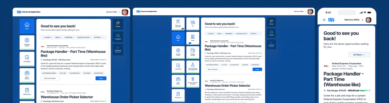
I did the brand identity and creative direction for Nucleo, a professional platform built for one of the most complex and regulated industries in the world. The challenge was designing a brand that felt credible and precise for life sciences professionals, while remaining modern and approachable for a platform that had never existed before.
Nucleo redefines how the life science community connects, collaborates, and grows. Designed by and for industry professionals, it brings together the right people, products, and opportunities within a single dynamic space, turning interaction into innovation.
With real-time verified information and a commission-free model, it empowers users to build genuine partnerships and accelerate progress across the industry.

The name Nucleo captures the platform’s essence: a central force where ideas, energy, and discovery converge, echoing the nucleus in physics and medicine, where life and potential begin.
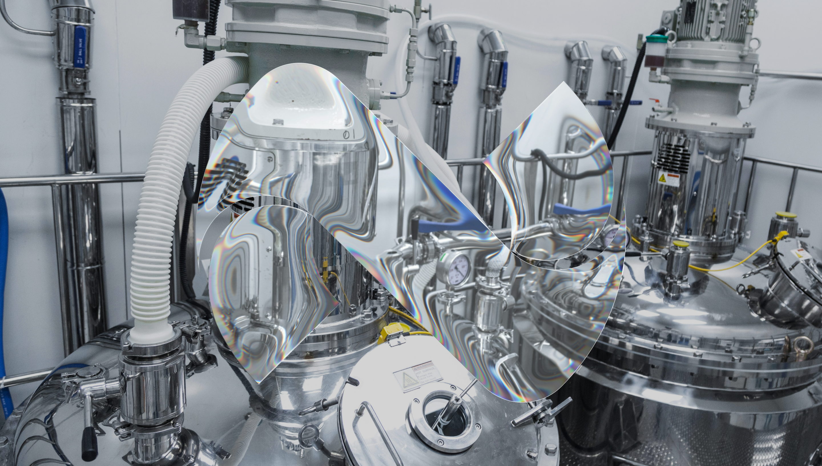
The brand needed to carry that meaning visually. Credible and precise for a regulated professional audience. Modern and open for a platform designed to make an industry more connected.
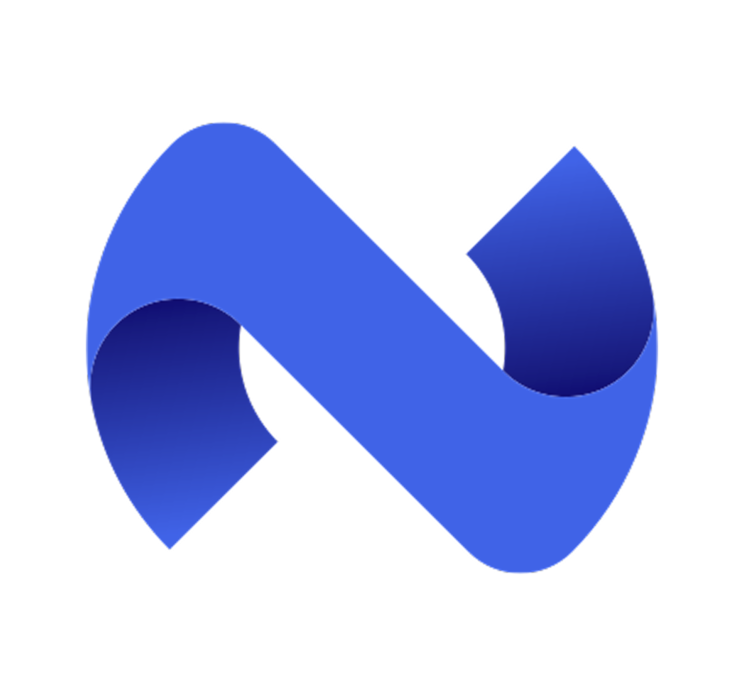
The logotype uses the letter “N” as its structural framework. The central nucleus emerges from the inherent negative space within the letter’s geometry, a composition where the absence of form becomes the presence of meaning. The result generates multiple visual interpretations depending on context: a network node, a nucleus, a meeting point.
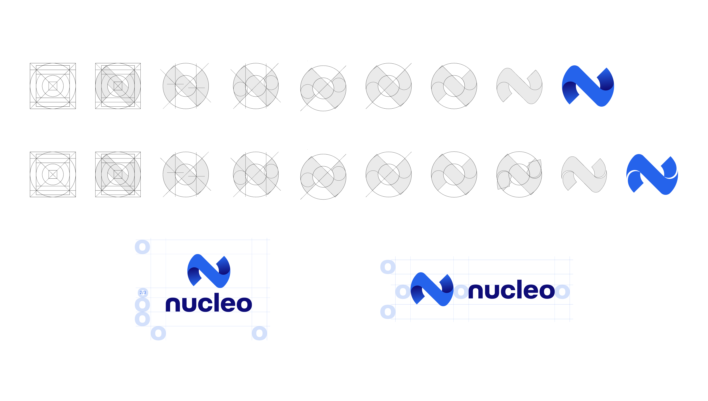
Logo creation steps and structure
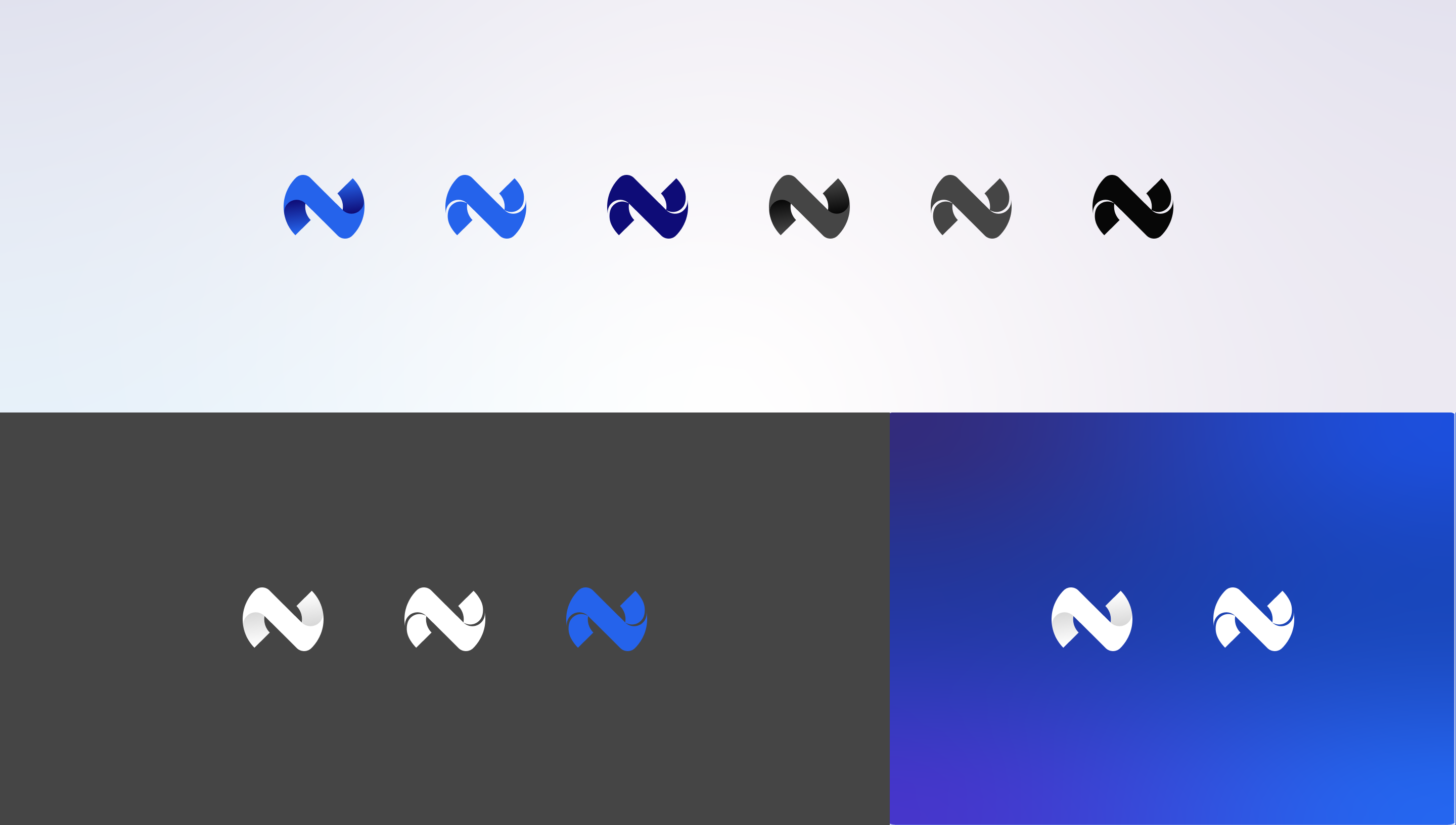
logotype options
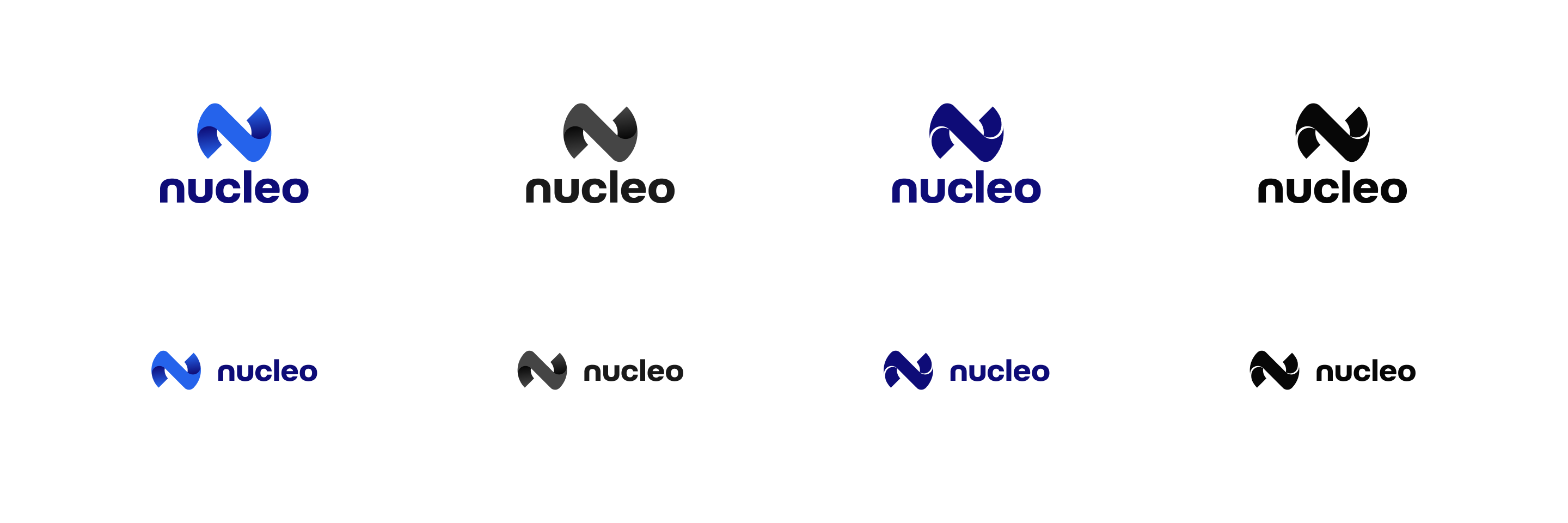
Logo options
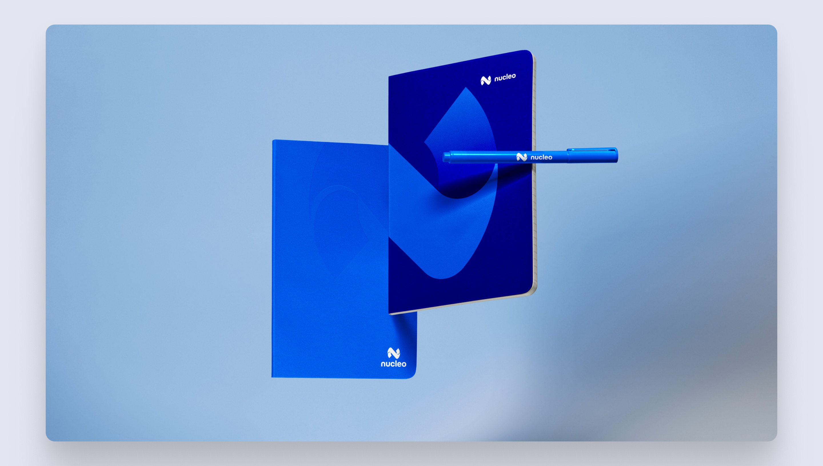
Merchandise and stationary
The Nucleo product design work is covered in a separate case study. If you want to see how the brand was translated into a product, visit the case study